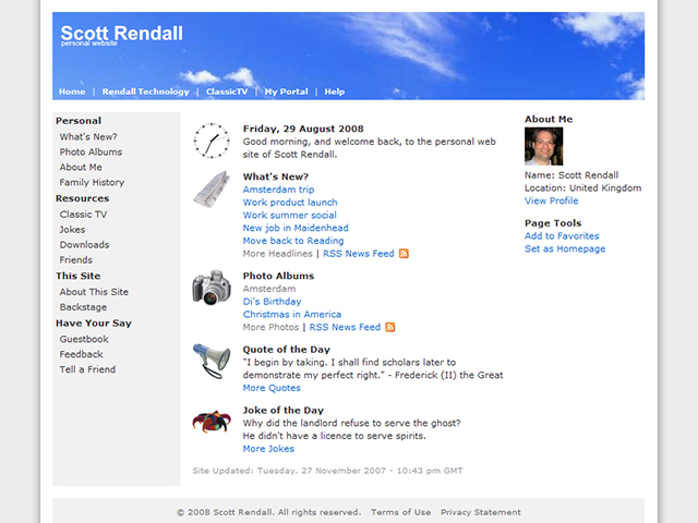
Scott Rendall website
The Scott Rendall personal website has been given a fresh new look.

All the pages have now been centred within the browser, with a subtle drop shadow to the background.
The entire site has been given a fresh lick of paint, including bright new photo icons being added to aid user navigation.
Major updates include a revamped news section, with full news articles and the ability for visitors to add their comments to the relevant story.
Hope you like it?
Comments
Write a comment